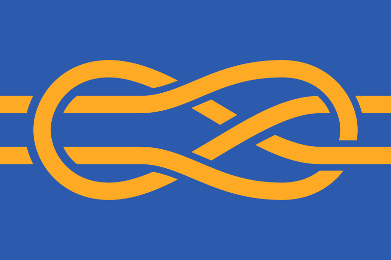
More Flags:


You’ve convinced me a little bit. Some of those flags do look good. Definitely not every flag though.
N- no??? Barfing a seal into the middle of a flag definitely does not improve it imo.
Wow, this is a… hot take. I mean by all means defend your opinion but hard disagree lol.
Canada’s one might look, a bit odd like that
There’s a place for both. I like the abstraction of regular tri/bicolours, and I also like the added detail of coats of arms or other emblems.
In the case of the Union Jack it doesn’t really work at all, though. I think it detracts from the interesting construction of the flag.
I also don’t like this Palestinian flag. The eagle looks off-center because of the triangle, but if you were to put it in the center between the triangle and the end of the flag (I’m not really familiar with flag jargon), it’d probably still look off-center. That, and the flag re-appearing in the emblem gives a bit of an annoying Droste-effect (might want to add the eagle in the emblem as well, with another flag with another eagle, with another flag…).
No
Ukraine and Germany look good. France looks less generic (it’s hard being a trailblazer; everyone else imitates you). The rest? Nah.
In Germany, only officials or fascists use the CoA flag.
omg…srry I didn’t know, I’ll remove it
It’s not that bad, there is just a lot of carefulness around the German flag except by the far-right.
Using that flag is also a bit of a football hooligan thing, right?
How unfortunate, guess that leaves only Ukraine.
I think Poland’s coat of arms flag is nice too.

I can’t see those embedded SVGs. (I use the regular
lemmy-ui.)
Nah. Needs more detail, text, and preferably also some numbers. If a child in a kindergarten is able to draw more than 10% of the flag, you’re doing it wrong
Dear politicians,
This guy is being sarcastic. Please stop.
Thanks

