
My favorite terrible emoji design is the thinking face Microsoft originally used:
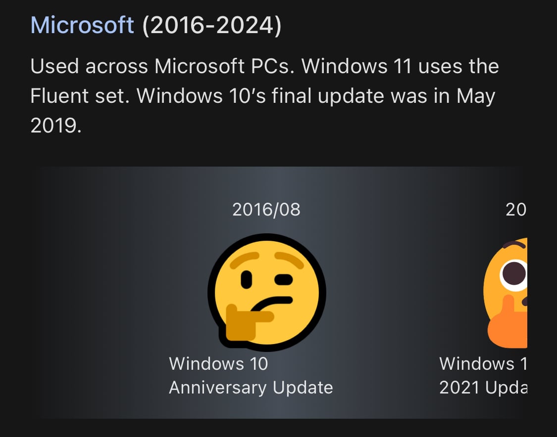
My favorite terrible emoji design is the thinking face Microsoft originally used:

I’ve never heard of it before either. It doesn’t seem weird to me. Just, the assertion that it’s overwhelmingly common does not sound right.

I’m sure stuff like this could be locked down via Enterprise deployment controls.
They are doing good! They just had their 17th birthday!
Best internet cat.
Makes me think of the Power Mac G4 Cube.

Major security/privacy holes in any technology should cause “recalls” too. 🤔
It was already in bad health. That’s not a good combination with COVID.

Oooo. Will it be automatic? Or do you need to pass a flag?
It would be neat to know precisely what parts are expensive. Broad generalizations about how prices on goods go up and down aren’t quite as interesting. 😅


This is the second service in as many weeks to be shut down offering this service, right?
It’s a small lemmy.world.
Sounds like someone needs to make a community for that.
Otherwise, this is what technology is these days. And I’d say that staying blind to things like this is what got us into many messes.
I remember when tech news was mostly a press release pipeline. And when I see these comments, I see people who want press releases about new tech to play with.
Now duplicate posts. Those can fuck right off.
Severance is really special. There is a season two coming, but it was delayed for a variety of reasons.

The updated graphics do look super pretty. This is a classic, and if this keeps new people playing it into the future that’s awesome.
I think of remasters/remakes like this like I do brand new 4k HDR remasters of classic movies. Since they are shorter focused narrative games.
huh, I opted into the new layout months ago. I got use to it quickly.
Edit: I went back to discord to find the server tray/drawer the beta had disappeared. If this is the final version, I’m surprised people are upset. The drawer was the most radical change.

I wish it used the native share sheet too. On iOS it always feels like it’s done this way out of spite. To avoid the native UI. It’s funny that the same thing is done on Android.
Hey fucker, this is beautiful.


Because you can use it to show confusion. 😄