*not the author
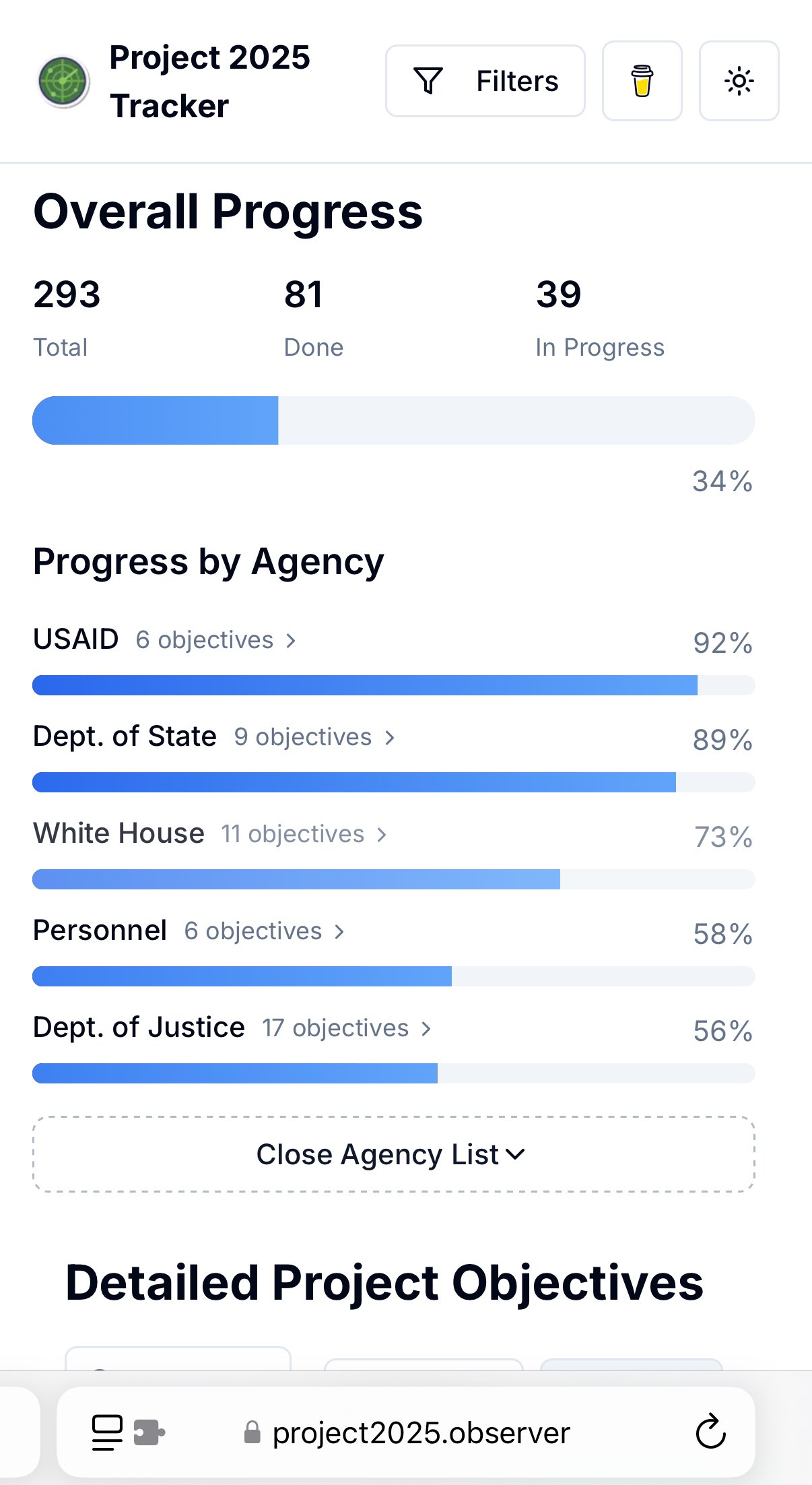
This tool live tracks the progress of the various campaigns promises that were part of the Heritage Foundation’s Project 2025 manifesto, which supported Trump during his last campaign.
Tap for spoiler
https://www.project2025.observer/
~Personal note: one of the authors is the mod of r/keeptrack, and I hope she strongly considers coming over here~
I guess beauty is subjective.
The content and topic of the data don’t affect if it’s well presented. You can hate what it’s about and still appreciate the design of how it’s presented.
The beauty here is the clean presentation and directness. Like a guillotine- everything you need to do the job, nothing you don’t.
Data is
BeautifulBlandly Presented but Terrifying