Yeah I’ve just been pretty disappointed from most of the field. Idk what I was expecting but pretty much more of the same from last year just feels lazy and meh.
Believe me as a redbull fan for the last ~10 years I have been greatly disappointed with my teams choices around livery changes lol.
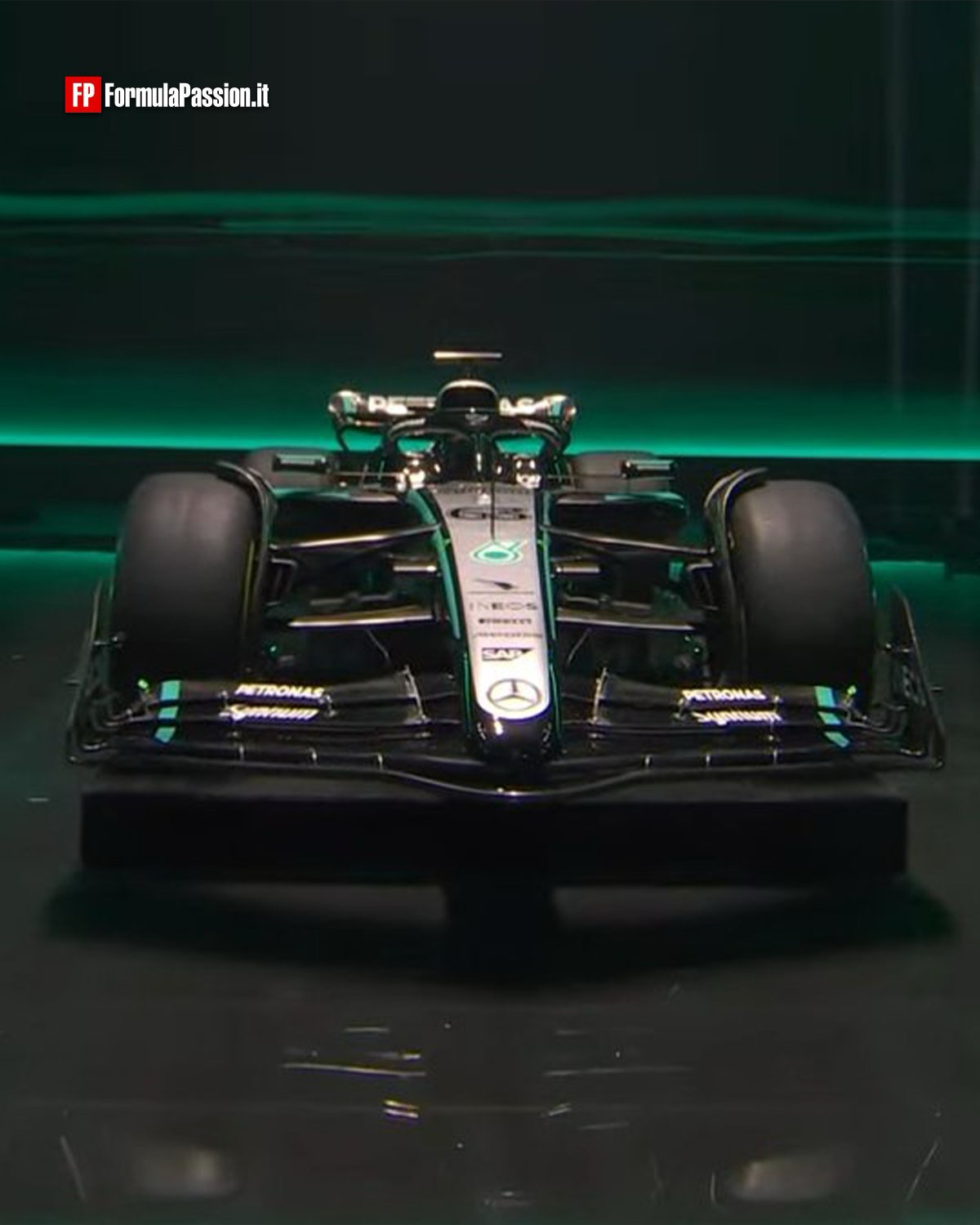
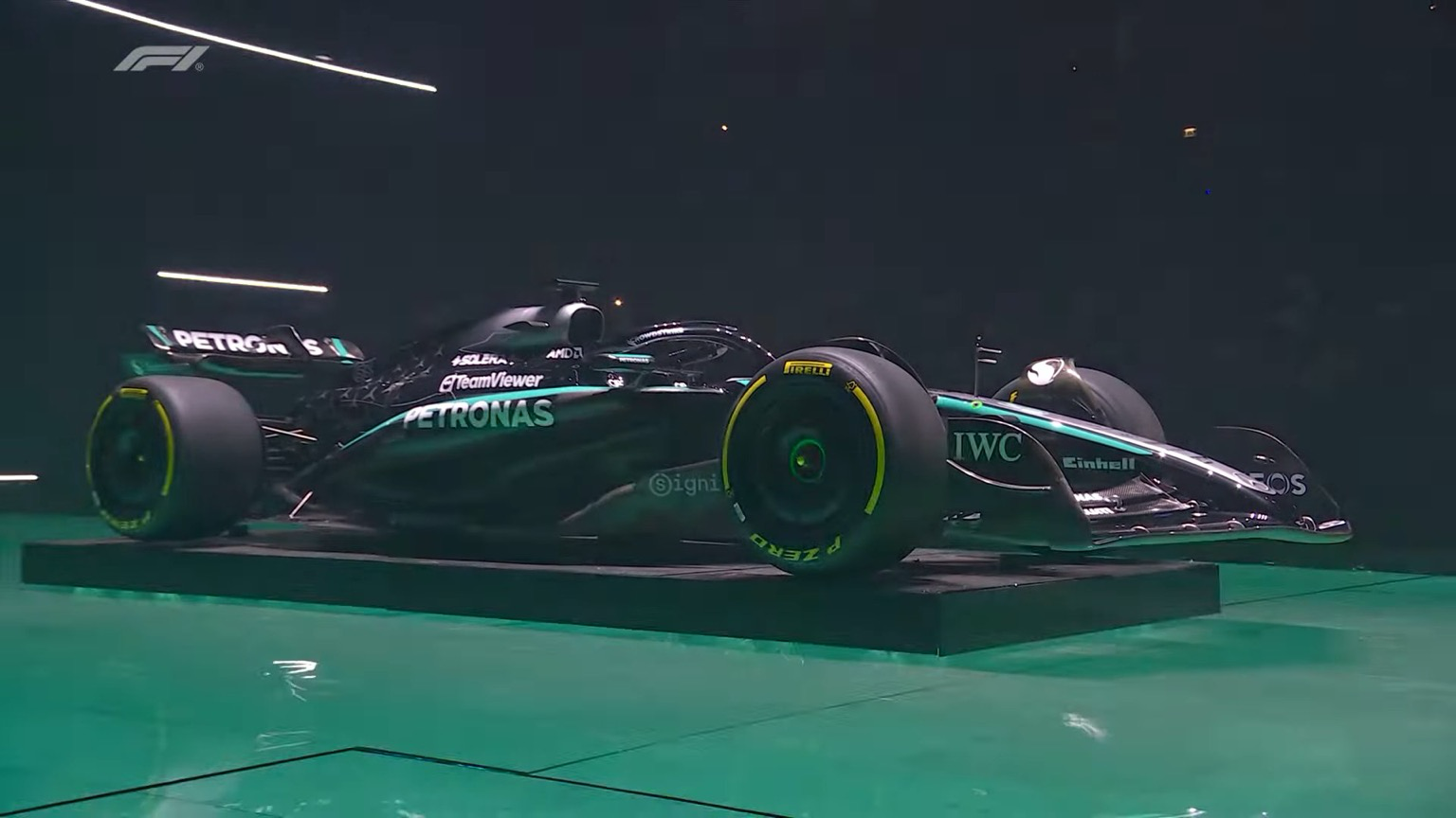
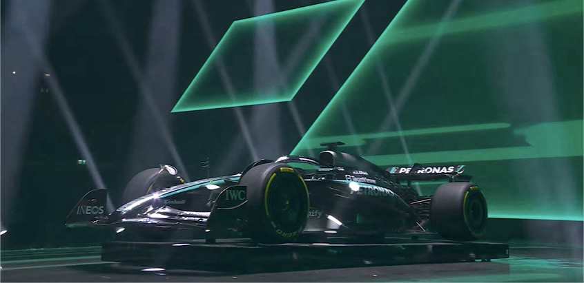
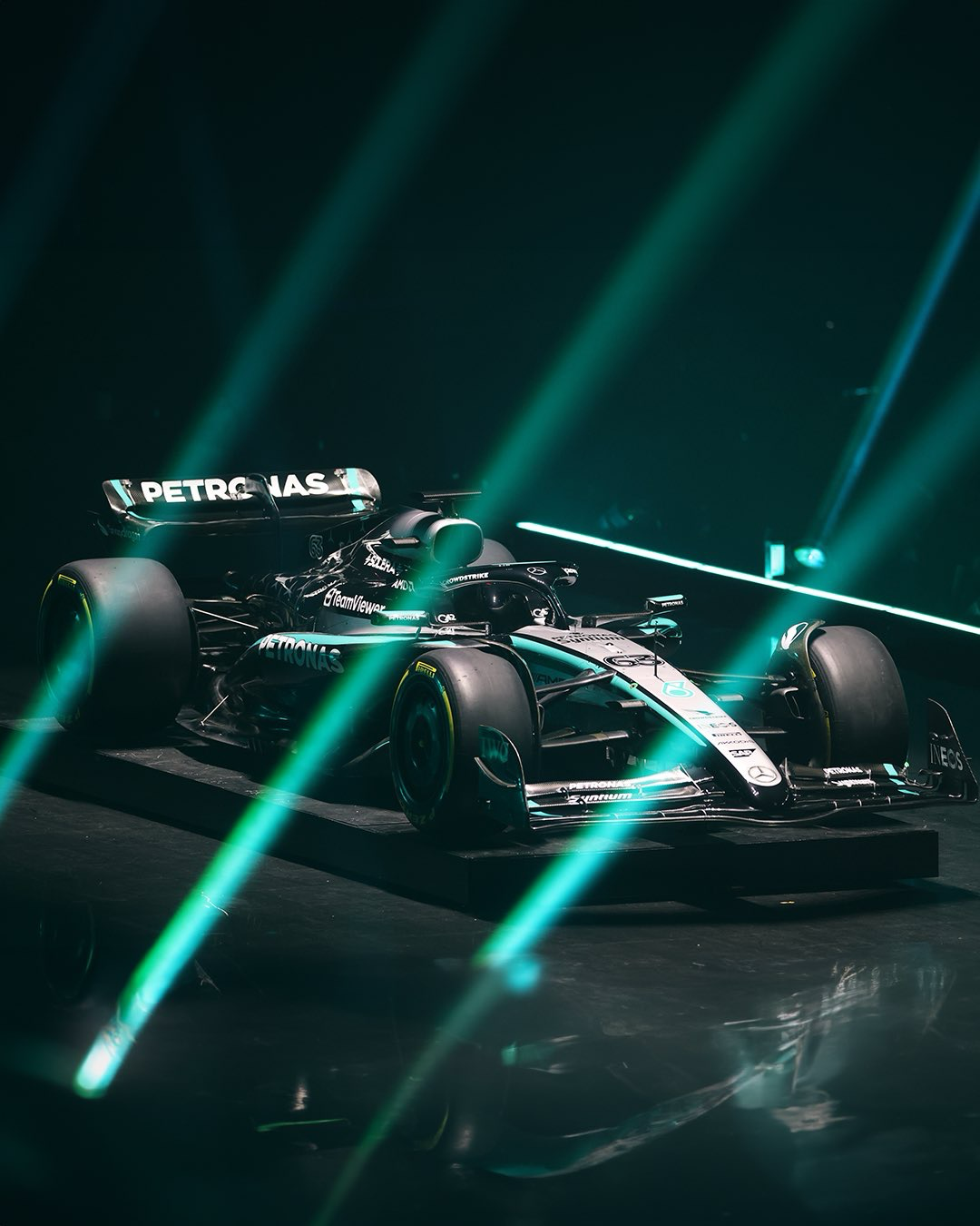
I think the black Merc was slick in 2020.
The 2022 Ferrari looked great imo.
I just don’t know if it’s possible for modern F1 to have anything like the Jordan 7up car or the MP4/4 from McLaren. Something where a single advertiser drives the design of the vehicle to a point of beauty.

Is it just me or are none of the liveries really doing much for anyone else this year?
The kick one looks a little better now. Everything else has stayed exactly the same or gotten worse.
The HP logo and white band/wings ruin the Ferrari. Shoulda kept it all dark red and black.
Same. They’re basically unchanged from last year. I think VCARBs look the best.
Yeah I’ve just been pretty disappointed from most of the field. Idk what I was expecting but pretty much more of the same from last year just feels lazy and meh.
Yeah, the traditional ones we want to see have gone to shit. The ones that could be bold, retro, anything, are just sanitized billboards.
Believe me as a redbull fan for the last ~10 years I have been greatly disappointed with my teams choices around livery changes lol.
I think the black Merc was slick in 2020.
The 2022 Ferrari looked great imo.
I just don’t know if it’s possible for modern F1 to have anything like the Jordan 7up car or the MP4/4 from McLaren. Something where a single advertiser drives the design of the vehicle to a point of beauty.