silence7@slrpnk.net to Technology@lemmy.worldEnglish · 1 year agoMicrosoft Word’s Subtle Typeface Change Affected Millions. Did You Notice?www.nytimes.comexternal-linkmessage-square63fedilinkarrow-up1192arrow-down112
arrow-up1180arrow-down1external-linkMicrosoft Word’s Subtle Typeface Change Affected Millions. Did You Notice?www.nytimes.comsilence7@slrpnk.net to Technology@lemmy.worldEnglish · 1 year agomessage-square63fedilink
minus-squareXtallll@lemmy.blahaj.zonelinkfedilinkEnglisharrow-up3·1 year agoI hate the “h” in the new font.
minus-squarelittletranspunk@lemmus.orglinkfedilinkEnglisharrow-up6·1 year agoI agree with you and I also hate lowercase e
minus-squareBlueÆther@no.lastname.nzlinkfedilinkEnglisharrow-up4arrow-down1·edit-21 year agof and r are doing me [edit], but you are right e is an eye sore
minus-squarewia@lemmy.calinkfedilinkEnglisharrow-up1·1 year agoLove the feel of the new font, the kerning is nice, but it really does have some whack letters. I do really love the lowercase L, I wrote love like that.
minus-squareastrsk@kbin.sociallinkfedilinkarrow-up2·1 year agoAt least the ! and @ are much cleaner and not italic.
minus-squareDark Arc@social.packetloss.gglinkfedilinkEnglisharrow-up1·1 year agoYeah the h is a bit too short… I’m really not super font sensitive though, if they weren’t right next to each other I wouldn’t notice

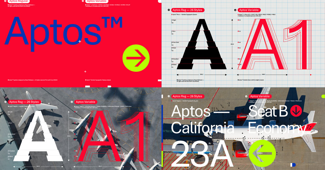
I hate the “h” in the new font.
I agree with you and I also hate lowercase e
f and r are doing me [edit], but you are right e is an eye sore
Love the feel of the new font, the kerning is nice, but it really does have some whack letters. I do really love the lowercase L, I wrote love like that.
At least the ! and @ are much cleaner and not italic.
For me it’s the “l”.
Yeah the h is a bit too short…
I’m really not super font sensitive though, if they weren’t right next to each other I wouldn’t notice