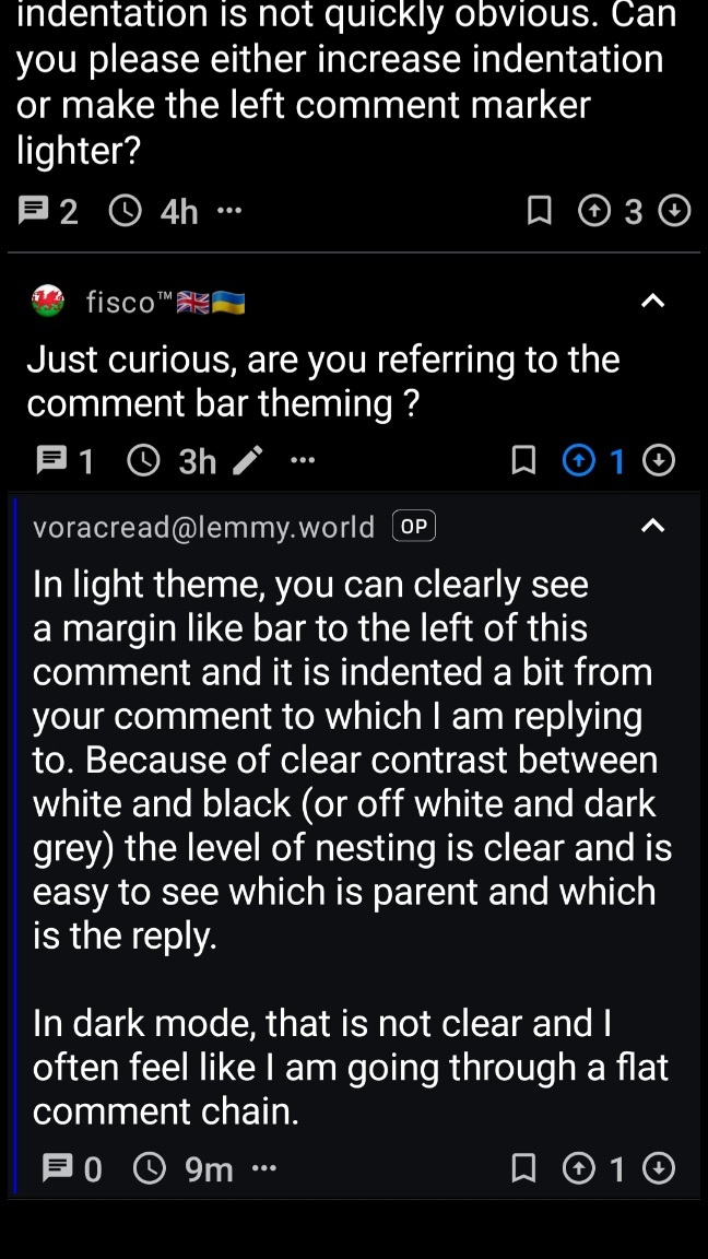
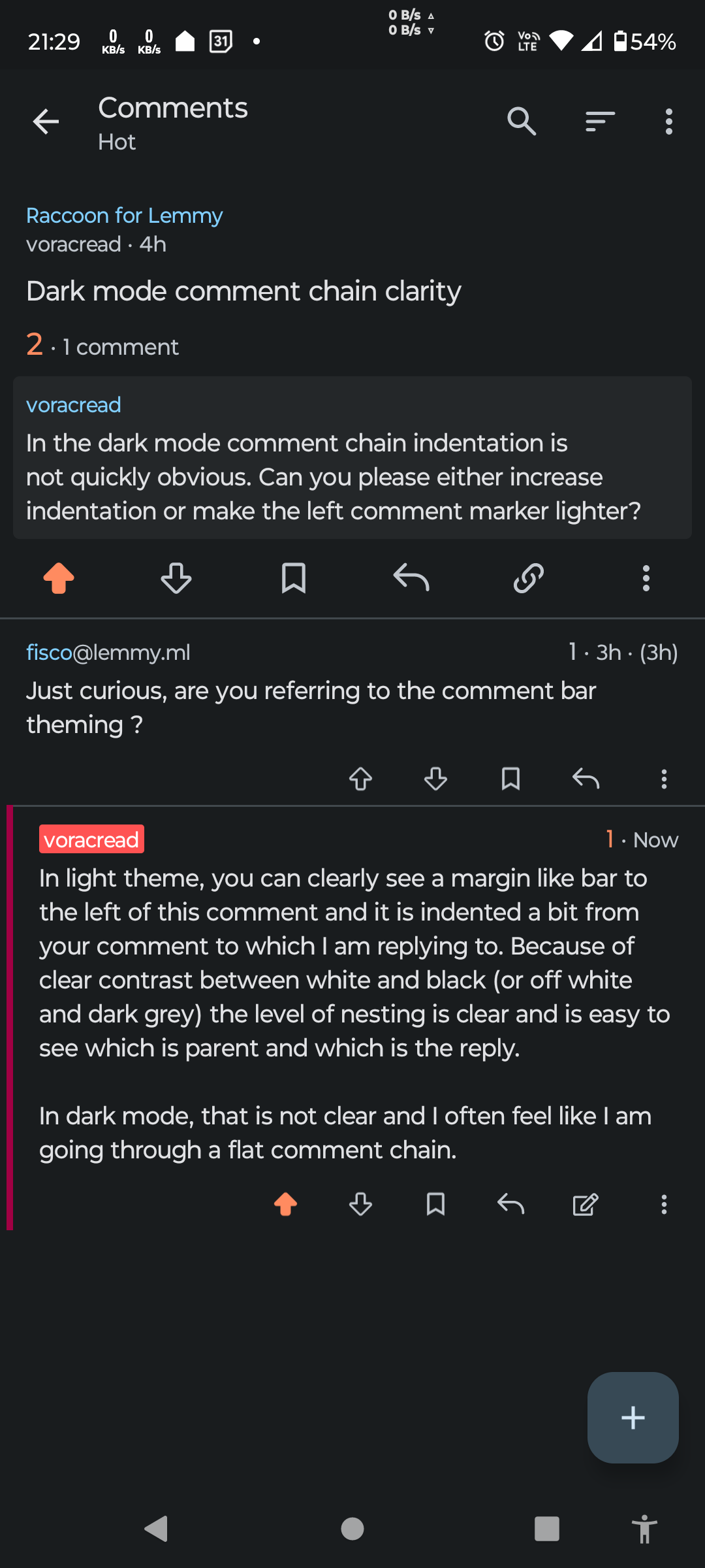
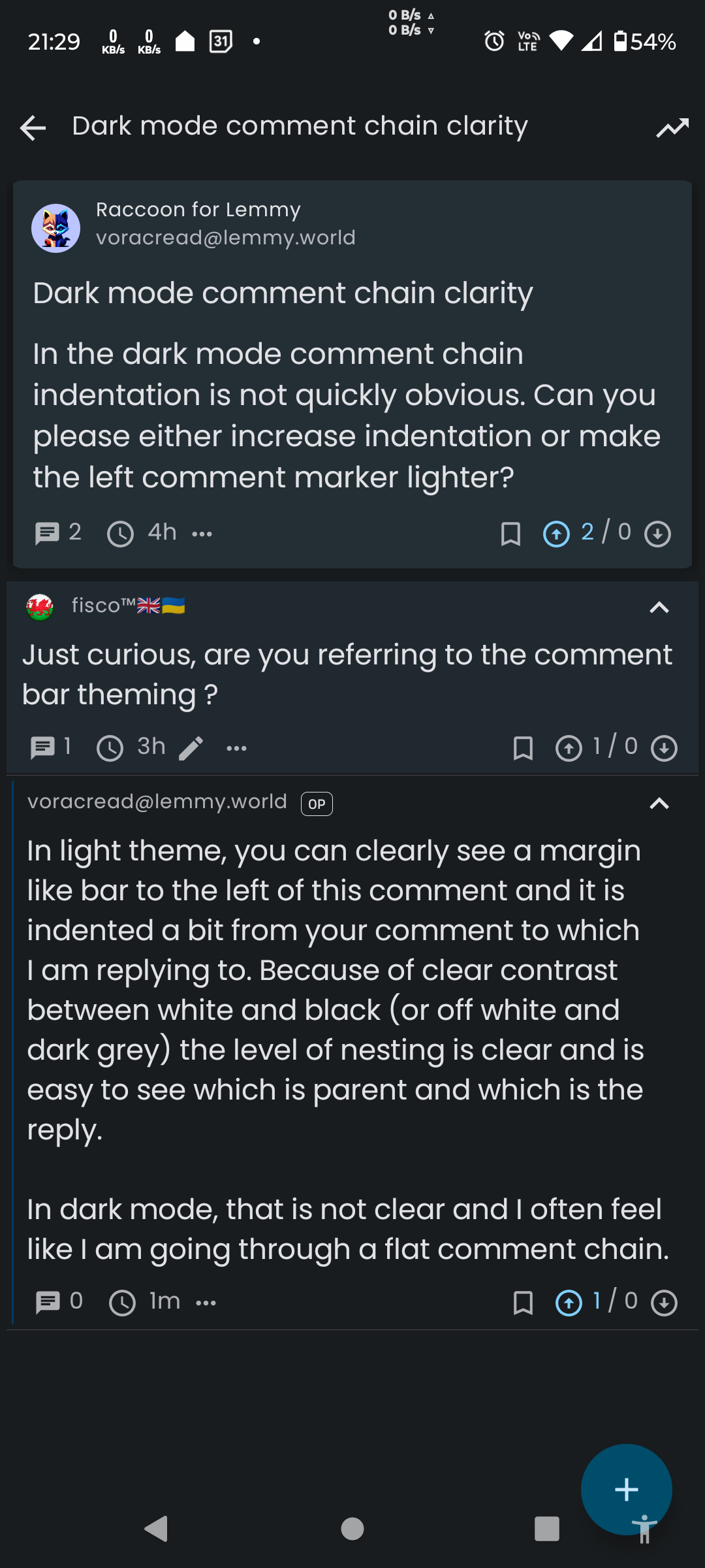
In the dark mode comment chain indentation is not quickly obvious. Can you please either increase indentation or make the left comment marker lighter?
Edit: Fixed by the dev with an option in settings to change comment bar width.
Just curious, are you referring to the comment bar theming ?
In light theme, you can clearly see a margin like bar to the left of this comment and it is indented a bit from your comment to which I am replying to. Because of clear contrast between white and black (or off white and dark grey) the level of nesting is clear and is easy to see which is parent and which is the reply.
In dark mode, that is not clear and I often feel like I am going through a flat comment chain.
This is how I see it… You might want to check in settings/colours and fonts, & change the comment bar theme to something more visible, as I have…👍🏻


For me it is more easily visible in Boost. May be it has to do with the thickness of the bar rather than colour itself.
For me, with theme set to pure black, view set to full (or card) & rainbow as the chosen comment bar theme, the distinction couldn’t get much more evident…🤷🏻♂️😅
Setting it to Rainbow improves things.
Guys, I should have made the bar a little wider or at least add an option to configure between different presets (like I did for colors), as many other Lemmy clients do… I’ll add it in the next release!
FYI I have version 1.7.2 pending review on Google Play and I don’t know why it is blocked there, usually reviews are really fast, this time God knows what has happened but it’s stuck.
Thanks for the option to set comment bar width. I am most comfortable with option 2.


