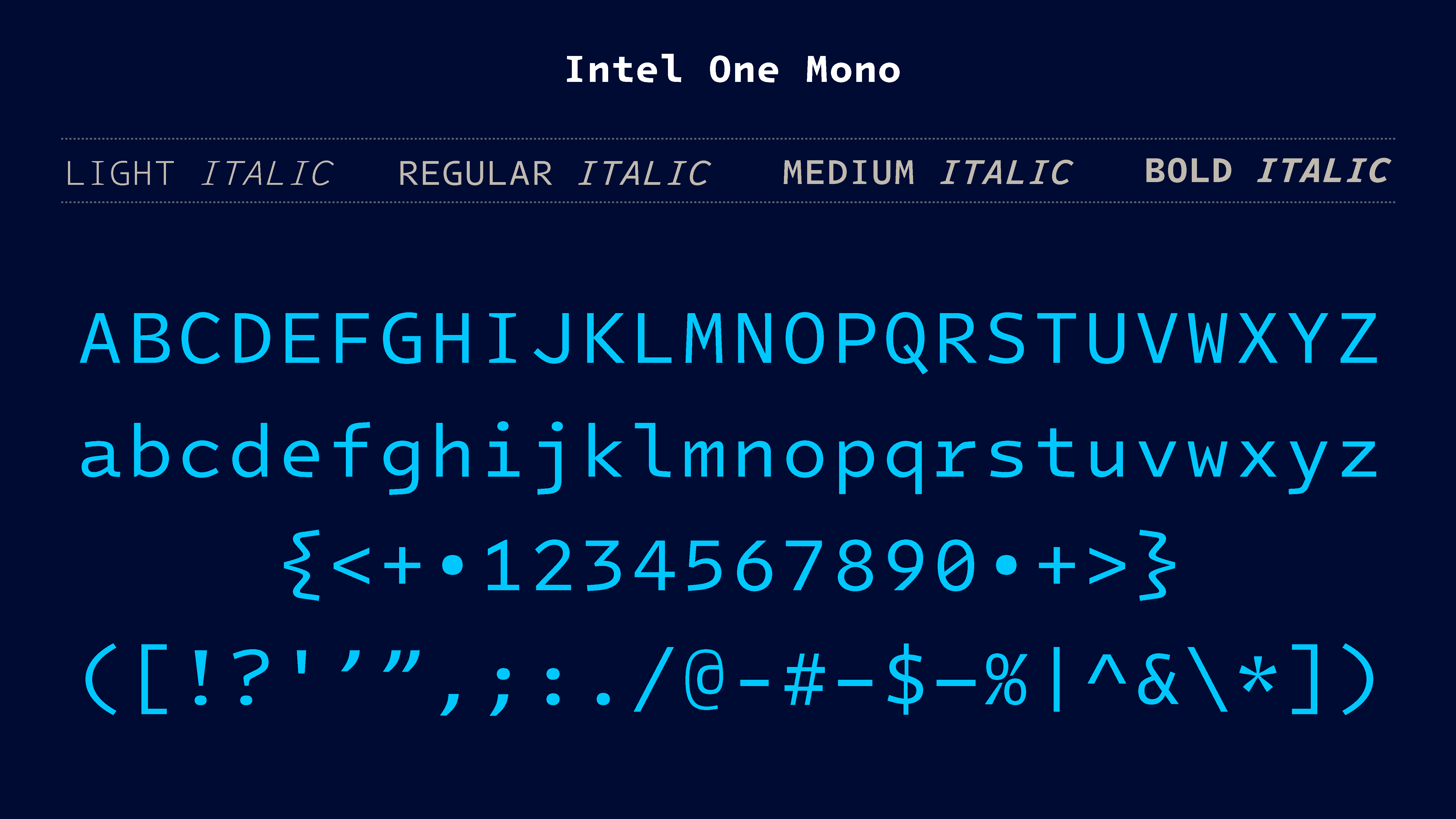
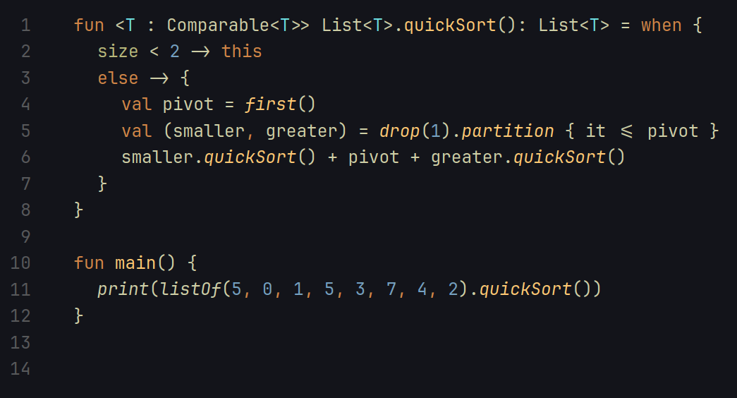
Designed to be easier to read and parse
I personally like the Jetbrains Mono font
damn my eyes are feasting rn
It looks gorgeous
Yup, that’s what I use simply out of not changing too many settings when I install an IDE.
You’ll have to pry Comic Code from my cold dead hands!
I might non ironically start using this
Somehow beautiful and terrible at the same time…
I’ve been using this for two days now on high contrast mode in Jetbrains IDEs I love it!!
Edit: wait I lied, I’m using Comic Mono, same idea though
I have Comic Mono too, it’s great. I’m using Comic Code for ligature support.
For my taste it looked a little too wide. Not as good as JetBrains Mono.
+1 for JetBrains mono. Been using it for years now.
I’ve been using Source Code Pro by Adobe for a few years now, which is confusingly named because it’s not a paid font.
Same! Although I suspect the
Probit came at the time when it still meanprofessionaland notfull version.
It looks alright. I might give it a try. I tested out a bunch of different mono fonts recently and landed on Fira Code. I’m still getting used to ligatures but so far I’m liking it more than I expected.
Love Fira Code with ligatures
For me Dejavu sans mono is a really good mono font, and it’s Foss 🙂
I don’t like fonts where the glyphs look wider than they are tall? In my head I call them ‘fat fonts’. IIRC Source Code Pro is like that? I used FiraCode for the longest time but recently migrated to Victor Mono. The Italics haven’t warmed on me but the rest of the faces including the Obliques look great.
The second time I heard about Victor Mono today. I might download it today.
I have a feeling you’ll enjoy Iosevka then.
I’m a Fira Code (patched w/ Nerd Font) user, but love to try out a new font every once in a while. This one does look nice. Will have to see about patching it w/ the nerd font glyphs, as my tmux/nvim output is going to look like garbage w/o those.
Looks too squished for me, I currently use roboto mono
I still find Fira Code and Meslo to be better. Nothing beats these 2 fonts.
I’ve been using Inconsolata
Something about just looks a little off.
I like the curly braces (much easier to spot the difference from some other fonts that lack a well defined point).
But I’m still a fan of fira code for generally well done ligatures.
Edit: fira code, not sans.
I’ve been using Hack for the past few years. But no doubt gonna give this a go.
Personally, I still prefer PragmataPro (tho I do admit it is a very expensive font), but this does look pretty good